

Ricoh-USA
Product Compare
Summary
The Sales department asked us to address customer complaints about comparing product specifications. Buyers wanted an easy way to evaluate multiple products and feel confident in their decisions; sales reps also expressed interest.
We conducted discovery interviews and shadowed sales reps to create “day in the life” reports, then collaborated with sales and merchandising stakeholders to define goals and a vision. We developed personas, journey maps, and prototypes, conducted usability tests, and launched the feature.
User complaints decreased, and sales reps noted that simultaneous spec viewing fostered a new sense of teamwork with customers.
You were validating:
- When breadcrumbs are appropriate
- How hierarchy should be expressed
- How patterns scale across products and teams
- How accessibility is handled in real-world systems
That’s exactly what senior, system-level UX research looks like.
Portfolio-ready sentence you can reuse
I researched established enterprise and platform design systems, including Material Design 3, Carbon, Lightning, and Atlassian, to validate best practices and platform conventions before designing the breadcrumbs pattern

Functionality
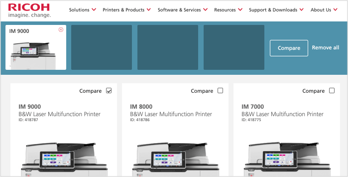
Up to four items could be added to the compare bar. A compare button brought users to the compare page. At any time, users could remove all items from the compare bar.

An example of the compare bar at the top of the page under the header on a product search results page.

Collapsable and fixed
The compare bar first appears on the product search results page, then collapses but remains visible as users navigate the site. Fixed to the top of the screen, it stays in view while scrolling. This design, based on analytics showing increased quote requests when items remain visible, ensures users don’t forget about their compared products.
An example of how the fixed bar looks on the homepage.

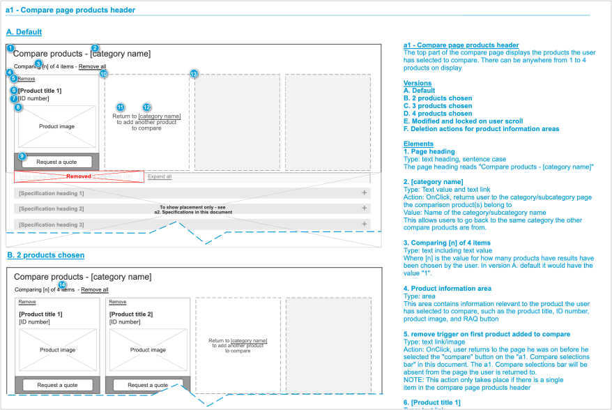
The Compare Page
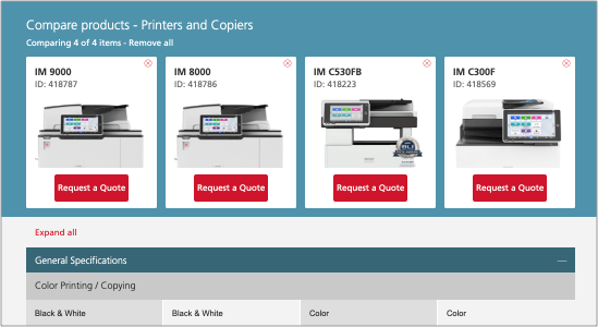
Specifications for chosen products can be viewed are on the compare page. Product specifications are listed in columns directly below the product card they represent.
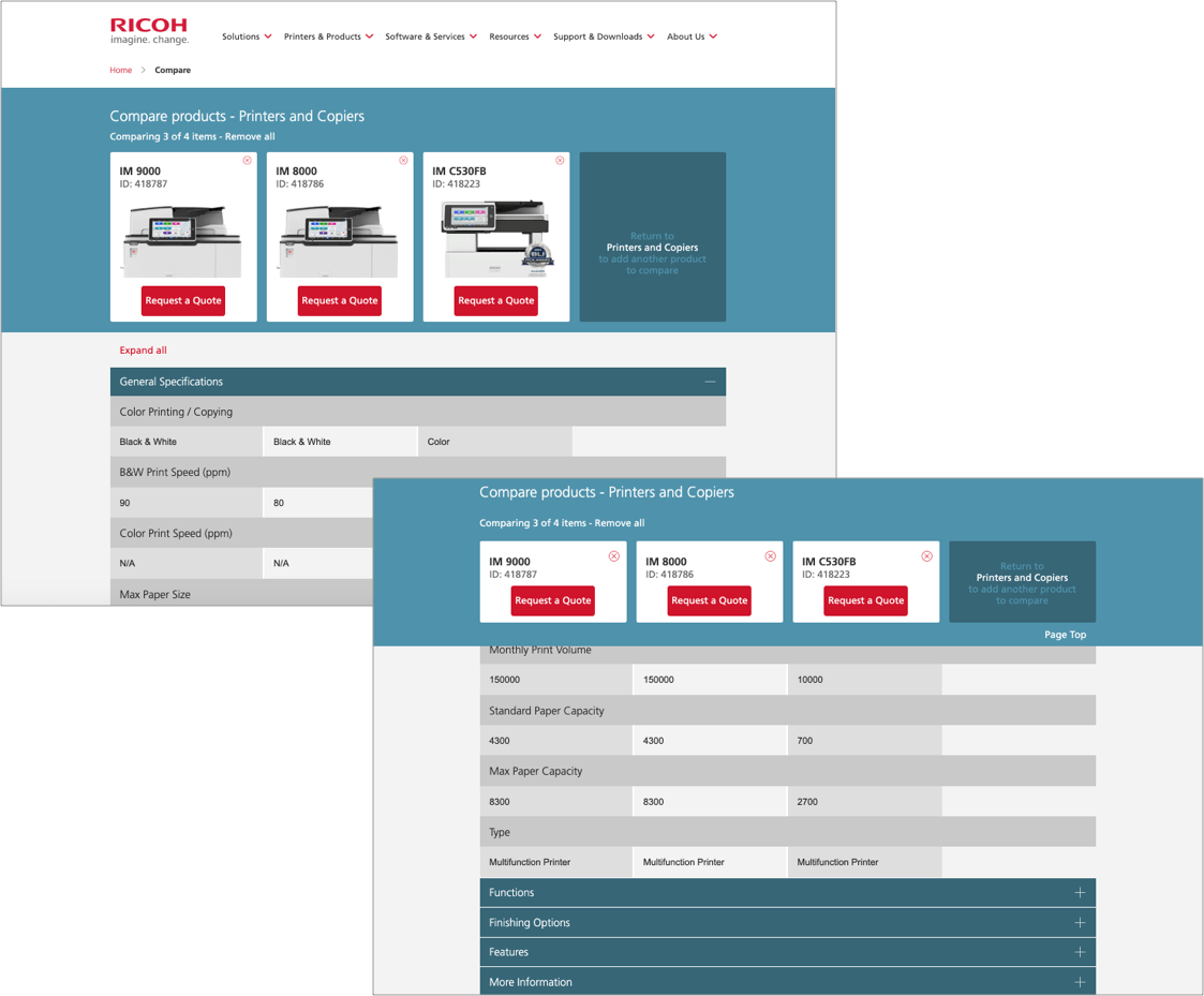
The images below show how items are displayed in the specifications area under the compare cards.

Specifications are grouped by category. The General Specifications category accordion is open by default, as can be seen in the image above. Users may collapse categories and open others for comparison. Users also have the option of expanding all of the category accordions with the Expand all link. The Expand all link becomes a Collapse all link.

Collapsing on the compare page for ease of use
As customers scroll down the page through the product specifications, the header collapses. This enables customers to view more specifications on the page at a glance. The image below shows a comparison of number of the number specifications under the full and collapsed bars. The top bar remains fixed as customers scroll down the page.
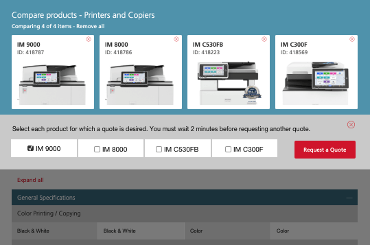
Addressing a backend issue: MultiQuote
After launching the compare feature, a long-standing backend issue surfaced: quote requests made within two minutes overwrote each other, forcing users to re-enter the same form. Previously rare, the issue became critical as compare encouraged rapid, consecutive quotes.
Customers began submitting multiple quotes quickly, but only the latest request was saved. This left sales teams unprepared and frustrated customers, creating a poor experience that needed immediate attention.
Because the backend couldn’t be fully fixed, the solution came through UX. Triggering the quote button opened a dropdown with checkboxes and clear messaging, allowing users to select multiple items. A redesigned form captured selected products, and added guidance encouraged users to wait two minutes before submitting again.
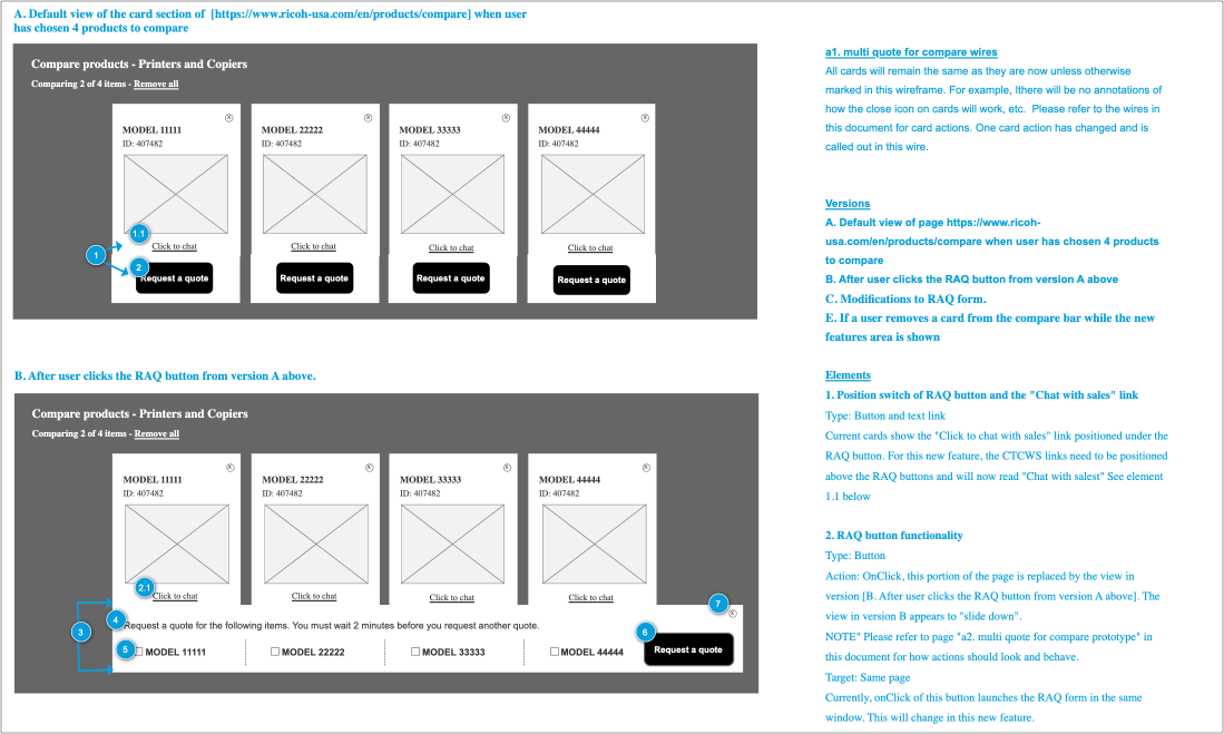
The image below shows the before and after triggered views of the animated dropdown for multiple quotes.
Before Request a Quote is triggered:
After Request a Quote is triggered:
Conclusion
The project was considered a success and helped strengthen relationships between sales and customers. Still, I would have preferred a full backend fix to eliminate the risk of quote requests being lost within the two-minute window. I also believe placing checkboxes directly under product cards would have made the experience more intuitive.
A mobile version of compare was out of scope. While challenging due to limited screen space, I would have welcomed the opportunity to tackle that problem for our users.