
Search & Filter
Overview
The ability to easily sort and filter search results is essential to customer success in finding the right product. The existing, horizontal filter feature was confusing for customers who were often frustrated with the experience. Problems included issues with labeling, size and arrangement, and functionality issues.
We asked, "How can we make filtering and sorting searched items easier for customers to use?"
Current state
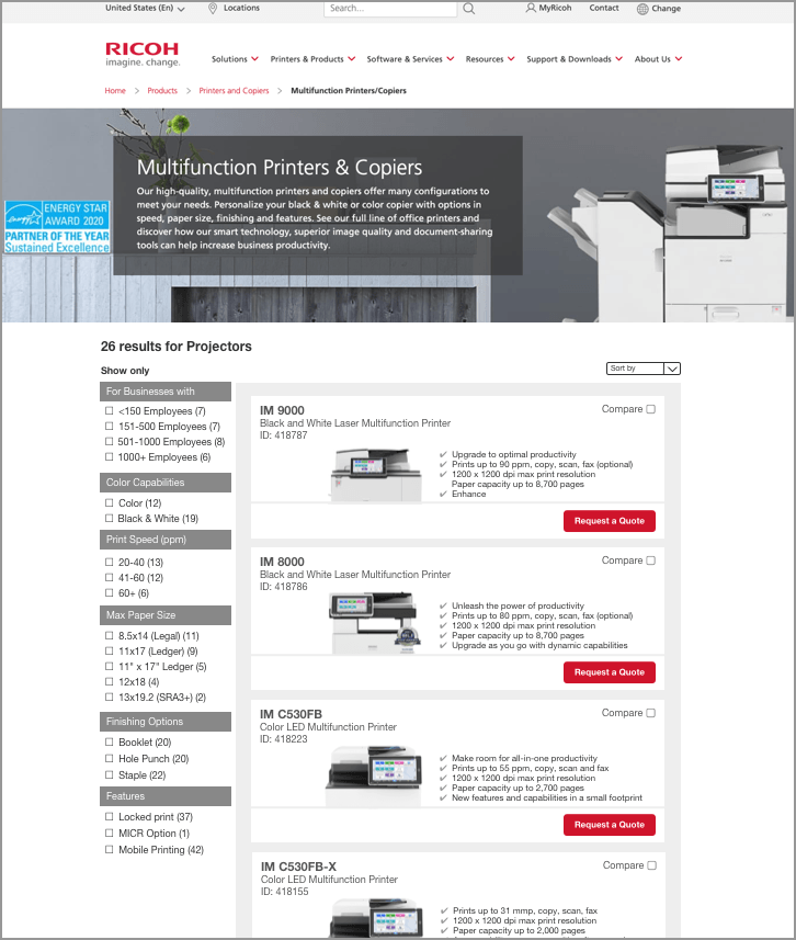
The image below is an example of a search results page located by navigation path. After a combination of user testing and analytics results, the following issues were discovered.
Our customers were often unable to understand the difference between the terms filter and sort. The word refine was used in place of filter in an attempt to help customers understand the effect filtering results has. However, divorced from the phrase "refine results" took customers also needed time to figure out what was meant by the label, refine.
The centered horizontal placement of the filter categories meant users couldn't see any products on the search results page because of its size, taking up two full screens. Some customers were unaware that they had arrived at a search results page because they were unable to see products. Users described feeling "lost" as a result.

There was an additional functionality issue. Once a customer selected a filter set checkbox, an animated page scroll down reveal the results of the search with the filter applied. This was to combat the fact that customers didn't think any results were returned because the products were displayed so far below the sizable filter method. However, if users wanted to select more filter parameters, they had to manually scroll to the refine area above each time a parameter was selected. Users found this extremely frustrating.
Below is a view of the page after a filter set was applied. You can see that the filter options are no longer visible.

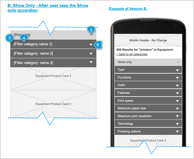
Show only
User testing revealed that our customers understood the function of filtering when we used the words
Show only as a label. Customers understood that they were being shown only results based on the filter sets they selected.
Customers are now able to select filter sets from an array of filter categories.
Managing filter sets
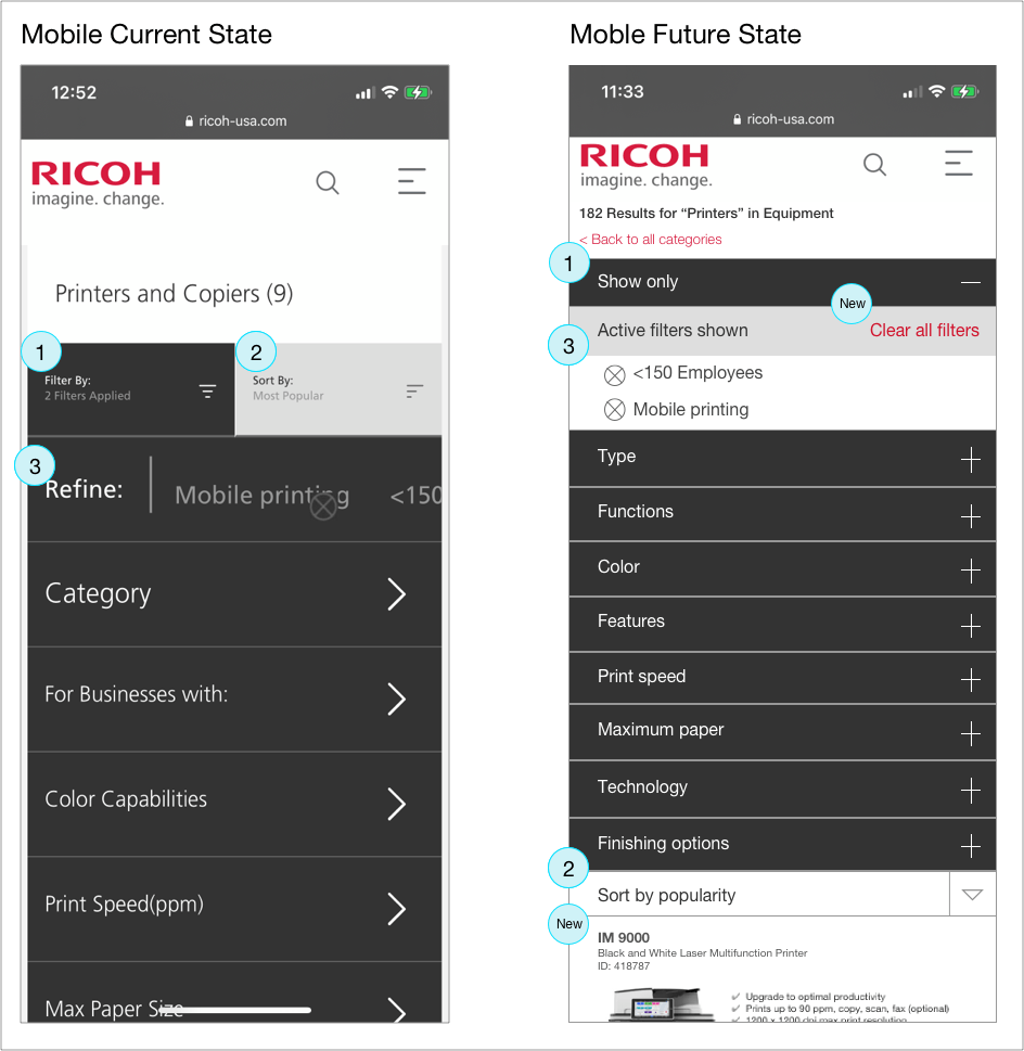
In the current state, once customers selected a filter set, it was difficult for users to manage options they had selected. On mobile, customers had to scroll horizontally to view and manage chosen filter sets. The sets were difficult to view at a glance,. Customers had to remove filter sets one by one, which could be time consuming depending on how many filter sets had been chosen,
An improvement was made to this feature. Customers can view and manage their selected filter sets without having to scroll horizontally. Customers can choose to delete filter sets one at a time or, a new option, all at once.
The graphic below illustrates changes from current state to future state on the mobile experience. The original design's horizontal scrolling to view and delete selected filter sets can be seen at marker 3.
Sidebar filtering
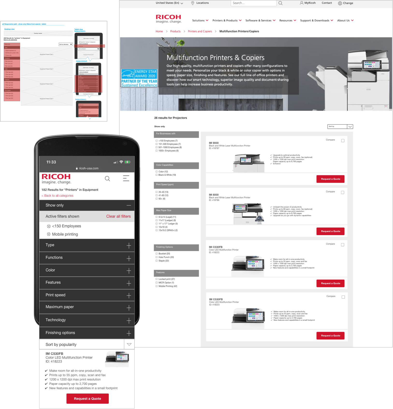
The redesign positioned the filter set to the left of the search results. The sidebar filtering interface on the left is the gold standard on desktop websites. It’s easier to skim and it can accommodate a larger number of filters, since it’s not limited to the page’s width.
This alleviated the scrolling to see products, which confused some customers,.
This also allowed customers to select as many filter sets as they wished while still being able to view products.
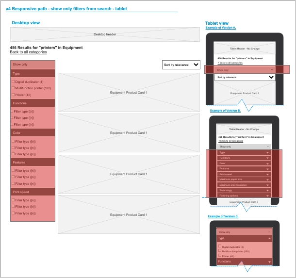
The designs for the desktop and tablet views were based on the design of the mobile experience.
View this page in Axure
View this page in Axure
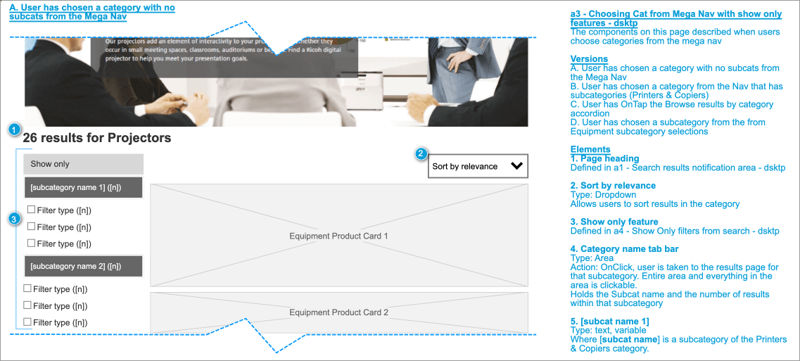
Below is a mockup of the desktop view of the new design .
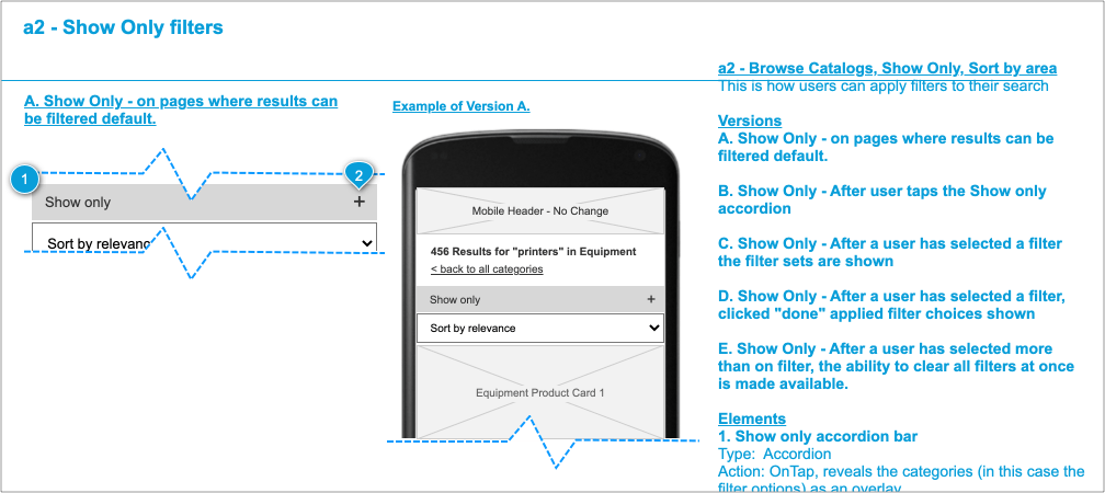
Because Ricoh-USA is a responsive website, and because the search was designed for mobile first and then for desktop and tablet, maps were created for the development team to add clarity about where sections would be located, hidden, or revealed on different devices.
Conclusion
Early design teams were tasked to create a unique method for sorting and filtering search results. They assumed a unique design would be exciting for customers to use and therefore encourage product sales.
Our team used site feedback features, analytics data, and testing with prototypes to determine that we could improve the design and make the experience more intuitive and less frustrating to our customers. Some product owners felt the original design was more creative, but there were no arguments about how well the new design performed in user tests.