

Support & Downloads
Summary
The merchandising team contacted the us about concerns prompted by a high percentage of calls to the help desk from users wanting equipment brochures and manuals sent to them.
Ricoh’s measures for reducing impacts on the global environment made these documents available online. Analytics reports and user testing revealed the search method that was too difficult to use.
We conducted a heuristic review of the old method to discover its pain points. We presented these findings to the Merchandising stakeholders and worked with them to determine the project goals and metrics for success. We then developed wireframes and small prototypes along the way to better explain how each piece of new page was working
In the weeks after launch, calls to the call center requesting manuals, brochures, and driver information were greatly reduced, and the number of manuals, brochures, and drivers downloaded increased.
Overview
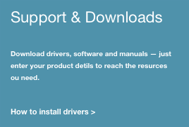
Ricoh-USA is revolutionizing the modern office with their eco-friendly products and solutions. In an effort fo become more environmentally conscious, product brochures, manuals, and driver information is no longer printed and delivered with equipment.
Feedback from users via a simple pop up, and reports of high call volumes at Ricoh call centers regarding customers asking for copies of manuals, brochures, and driver information, revealed that Ricoh's customers were having trouble locating these types of artifacts for their equipment models.

We asked,
"How can we help users locate brochures and manuals?"
Discovery
However, Ricoh-USA already had a feature that allowed users to search and download product assets.
Some in the company wanted to focus on driving users to the existing feature. However, after watching people interact with the feature during remote testing, it became clear that users could easily locate the existing search and download feature, but that they were uncomfortable and unsuccessful using it. when users responded that they were "having trouble locating" documentation, they actually meant that they were having trouble getting results from the current feature.
The question then became "How do we improve the document and driver search experience?"
This is how this...

became this.
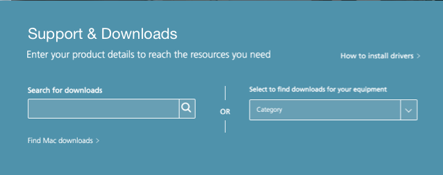
Search field redesign
The original search bar at the top of the feature was revisited after testing revealed the following issues.

The original search bar was a bit intimidating for a number of reasons.
- The search bar was far longer than than it needed to be. While a long search bar seems like a good idea for a number of websites, this was not the case for our application. The product names and model numbers users needed to enter are much shorter. At a glance, users did not expect the entry field was supposed to contain something as short as their product model numbers.
- Text was added to the search bar to help with this problem, Although this feature would return results for brochures and manuals, the text only mentions drivers, which discouraged users who were trying to find Brochures and Manuals.
- Text instructions were a bit lengthy, so customers didn't always read the instructions.
The redesign opted for a shorter and more appropriate text entry field length. The search icon was made larger, and the text was more concise.

Instructional text
The secondary text portion contradicts the instruction text in the search field above. It now includes software and manuals along with the drivers mentioned in the search field above. The instructions were a bit wordy as well.
Instructional text redesign
The new instructional text is much less wordy because other cues on the page inform users of the type of downloads they can expect. The link to install drivers has been place elsewhere on the feature area.

Dropdown filter issues
Many users wanted the option of finding materials by filtering by categories. The following method was used. It presented several issues for users.
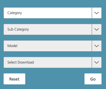
Dropdown Issue list
- Most categories had subcategories, however, many categories did not, which meant that when a user chose a category from the dropdown, they had to wait for the system to figure out whether or not to display a subcategory. This was awkward as the change of format was often distracting to users who had had to figure out what had happened. Lengthy wait times bred frustration.
- Users would choose a category and model, and be shown a Select Download dropdown menu, even when there were no downloads available for that piece of equipment. That meant that customers had to trigger a Go button only to receive the message that there were no download results.
- Small, three word results messaging, when returned, was easily overlooked and users sometimes didn't notice that messaging had been displayed.
- Because the call to action was labelled Go, users expected to be taken to another page.
- Users could not go back to any of the dropdown menus to begin a new search in a different category or subcategory. They had to select a Reset button and select all fields again, resulting in longer wait times if the user accidentally selects the wrong model.
- The Select Download dropdown also restricted users from gathering more than one asset at a time. If a user wanted a product's brochure, driver, and manual, they were required to go through the procedure three times, each time starting from the beginning using the Reset button.

Dropdown filter redesign
Wireframes and prototypes were created to work through these issues.
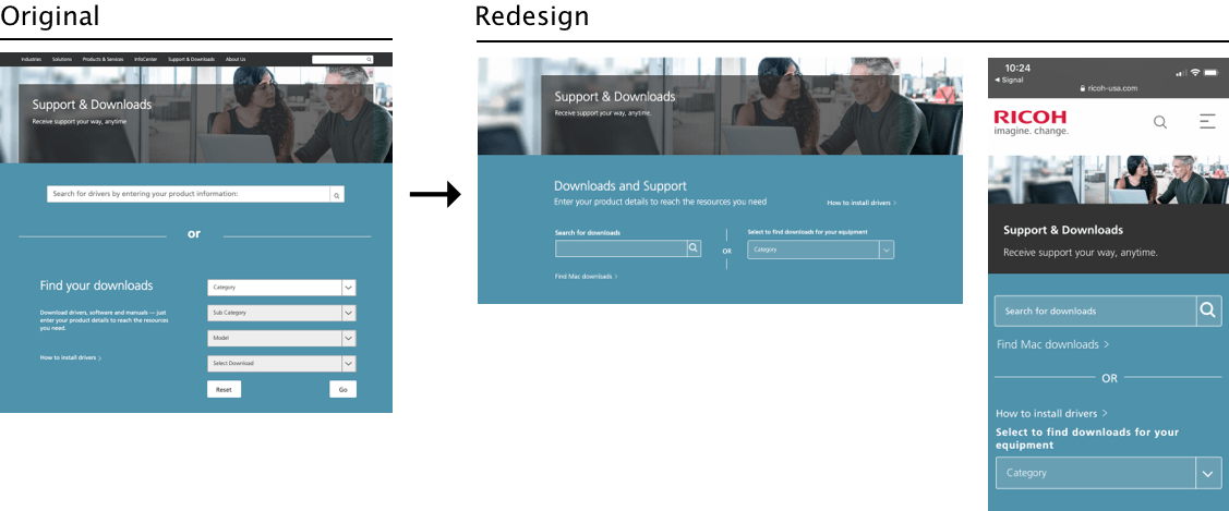
Rather than display all dropdown menus at once, dropdown filters were revealed progressively, as needed. This meant that a user would never be shown a subcategory if the category chosen did not have one, only to have it removed as they continued the process. Additionally, it seemed less daunting to look at one dropdown field instead of the previous four.
The Reset button was no longer needed. Users would be able to reselect any dropdown menu, enabling them to search in a different subcategory or model if they needed to, without starting a new search. The Go button was no longer needed. Once a model was chosen from the dropdown, results messaging appeared without having to trigger another button. If the wrong model was chosen, users could simply use the model dropdown menu again.
The dropdown for Select Download was removed. A search now produced all assets associated with the product.
Below are samples from the wireframes.
View the Desktop Prototype and Mobile Prototype

Redesigned Support & Download feature
The combination of the new smaller search field, concise messaging, and a progressive reveal filtered search created a feature that was far more elegant, usable, concise and roughly half the size of the one it replaced. It also worked on mobile devices. The original feature did not work on mobile devices.
Results messaging issues
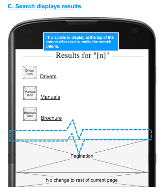
Results messaging on the original feature was easily overlooked. A simple line of text some distance away from the dropdown menus was the only clue users had that their search had worked. When brochures, manuals, or drivers were located, they were represented as links, Often the links were a series of numbers and letters that did not correspond to the model number and users were unsure which artifact the link represented. To solve this problem, wireframes were created to make it very clear to users whether or not their search returned any results. Results must be clearly marked so users knew if it was a brochure, a manual, or a driver, and which model they were meant for.

Redesigning results messaging
New messaging regarding a search that yielded no results was positioned closer to the search features and the text size was larger than before. the search term used was reiterated so users could check to see if they had made an error while typing. Messaging included suggestions to help users in the case that no results were returned.
When results were returned, they were accompanied by icons denoting which types of downloads were available. The links under them were labeled as a manual, driver, or brochure, and the link name contained the name of the model number searched for.

Conclusion
The final result met all requirements. User tests showed much improvement. Call centers reported a lower volume of calls regarding queries about drivers, manuals, and brochures.
If I had the time or resources, I would have liked to have worked on the dropdown filter search feature a bit more. Within the majority of the categories and subcategories there are far more model numbers than can be viewed comfortably within a dropdown menu. For example, there are an enormous number of model results under the subcategory
Multifunction Printers/Copiers. Those models are divided into series, such as the
Afficio 2000 series or the
FT4000 series. I would have liked to have explored filtering by by model series prefixes (Aficio, FT) and then by number series number (2000, 4000). Although it would have added more dropdown menus, I believe users would have been able to located their models even more quickly than by using an enormous, all encompassing list of models in a single dropdown menu.